Hi, I'm Geraldo and
I am a
designer.
developer.
human.
I am a
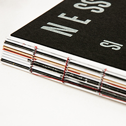
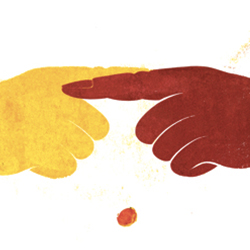
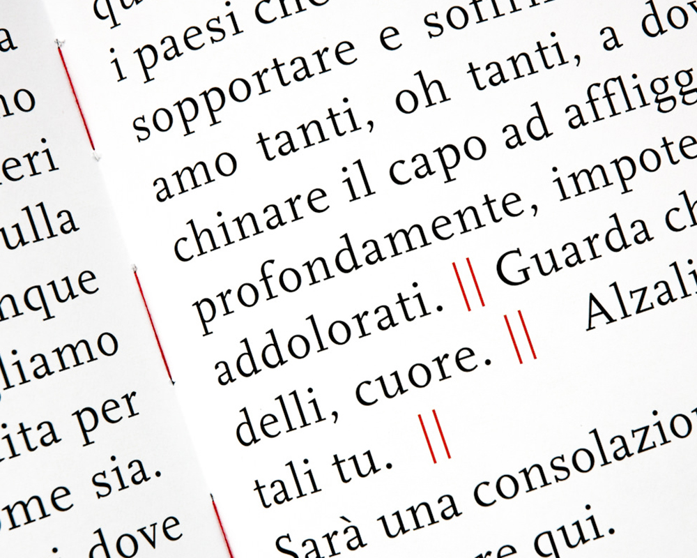
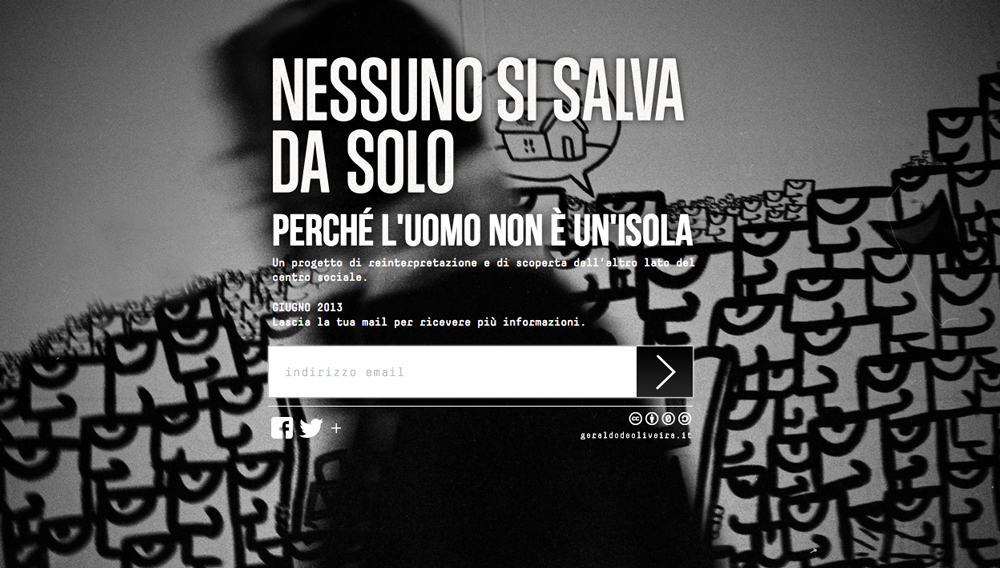
Una reinterpretazione dell'immagine dei centri sociali creatasi attraverso i mass media. Il progetto cerca di andare oltre i pregiudizi e gli stereotipi svelando un altro lato dei centri sociali e i servizi per la comunità che si svolgono.
Il progetto si presenta in un libro gra-fotografico composto da 70 fotografie, alcune composizioni grafiche e tipografiche e testi che aiutano a trasmettere i concetti nel libro proposti.
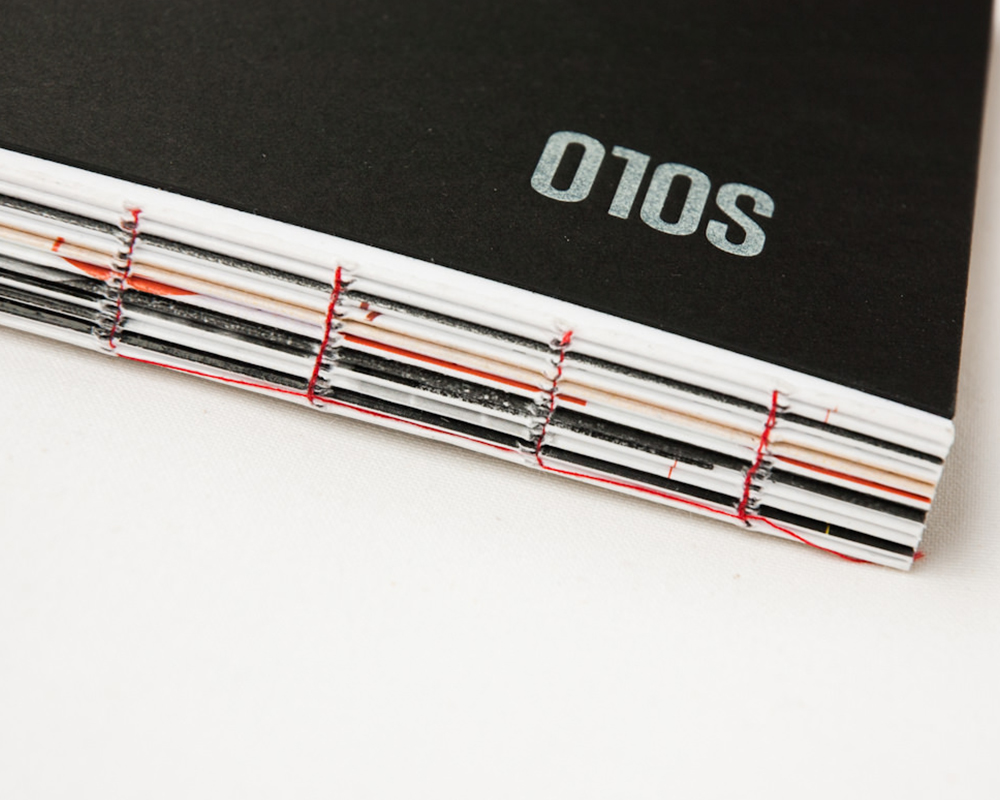
Il titolo del libro, NESSUNO SI SALVA DA SOLO, vuole mettere in evidenza l'importanza di aiutare i prossimi, specialmente in un periodo tormentato come questo attuale e l'importanza di vivere in comunità.
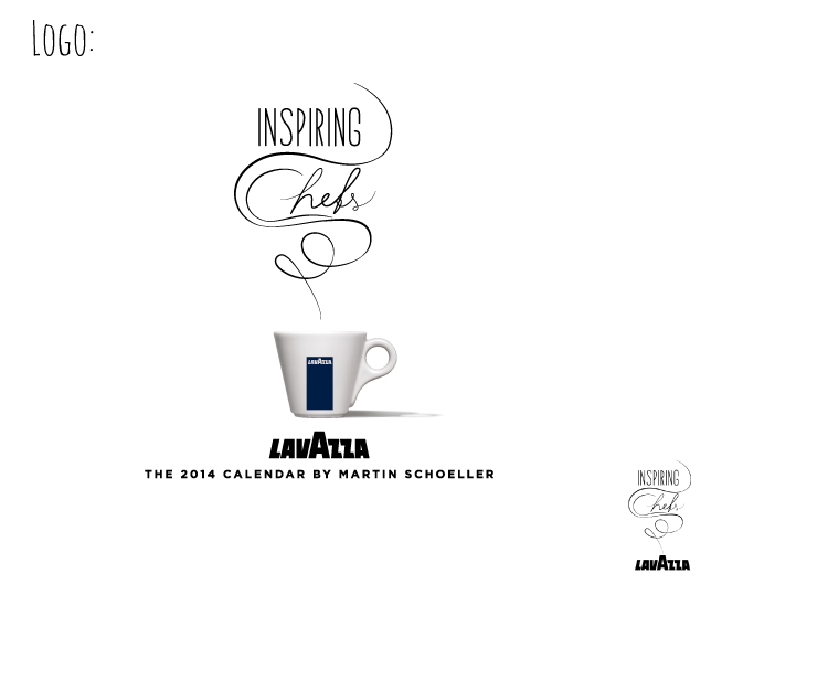
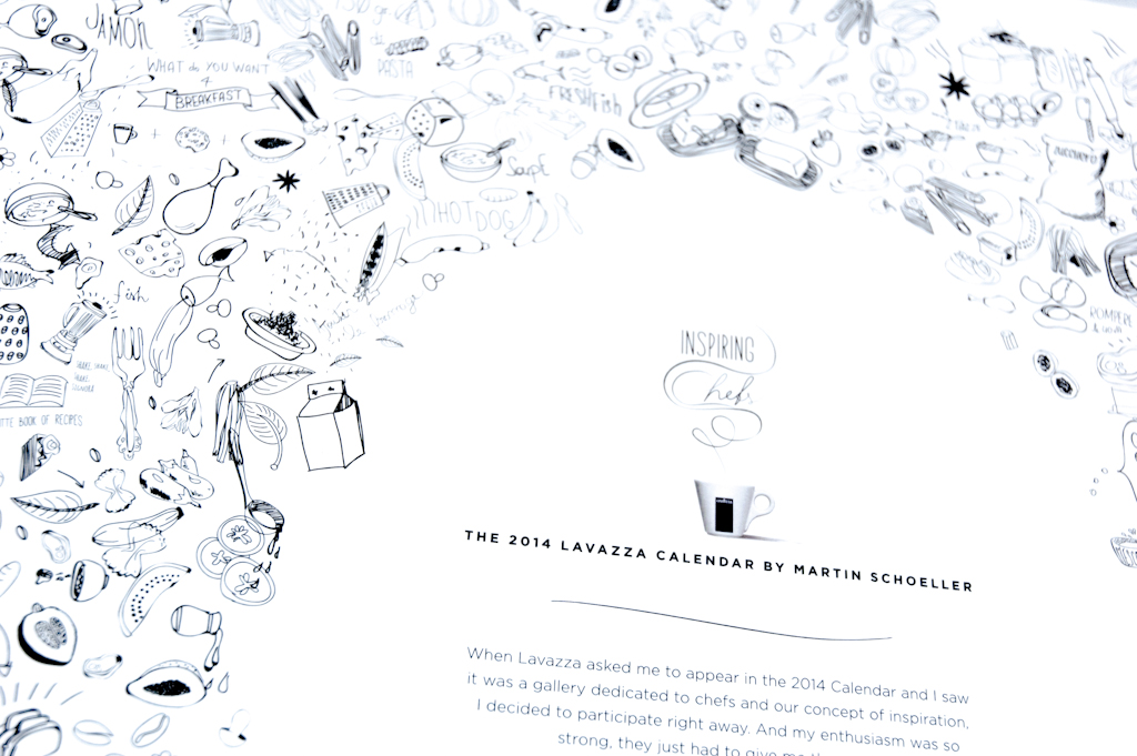
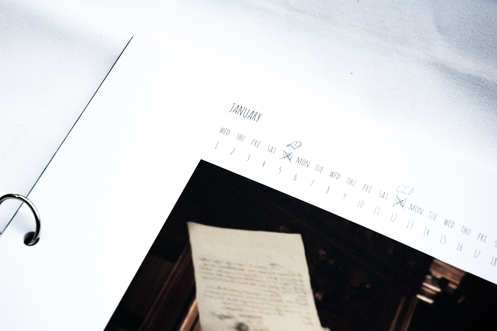
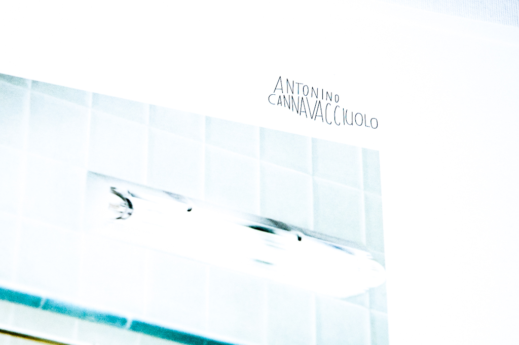
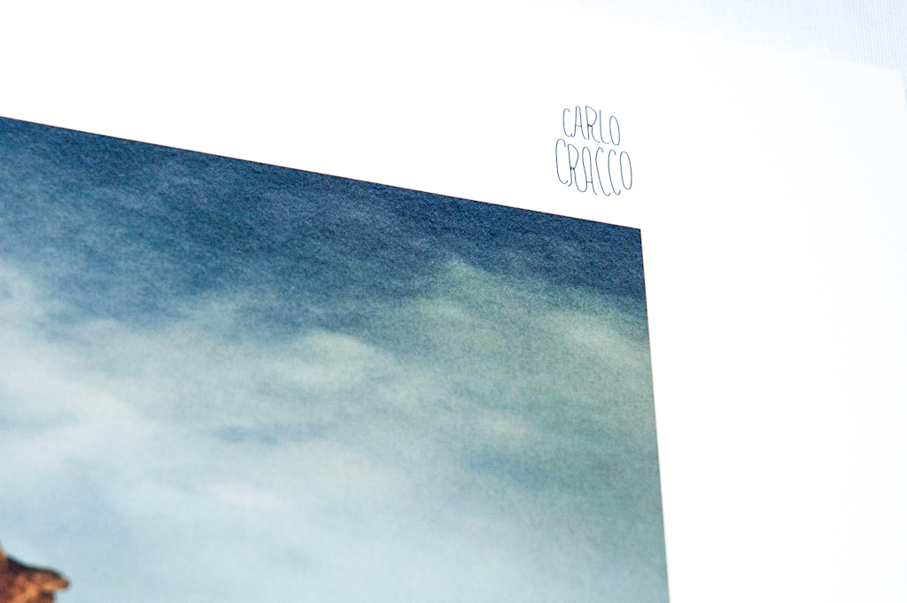
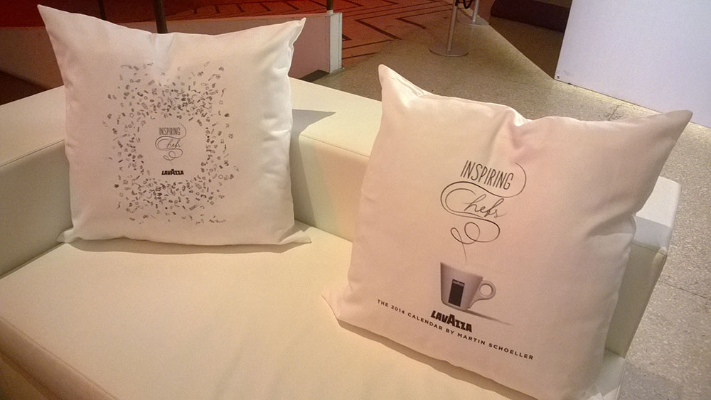
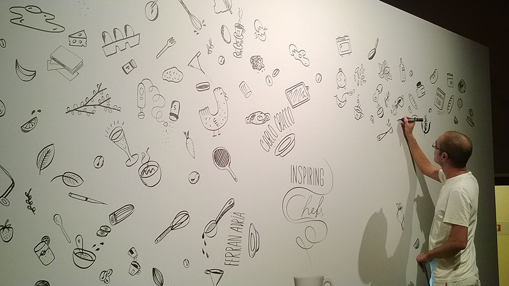
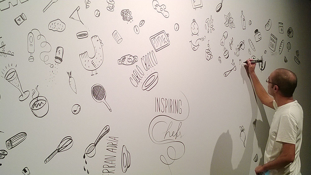
*educational projectInspiring Chefs is the title of the 22nd edition of the Lavazza Calendar, a reference of excellence for lovers of art photography and that, with the famous portrait painter Martin Schoeller, chosen for this year, transforming chefs in stars, those who make the inspiration their own mantra in the kitchen.
The inspiration
What moves it? There are rules that can help you find it? What actually stimulates our work?! From these questions and more, the 22nd edition of the Lavazza Calendar.
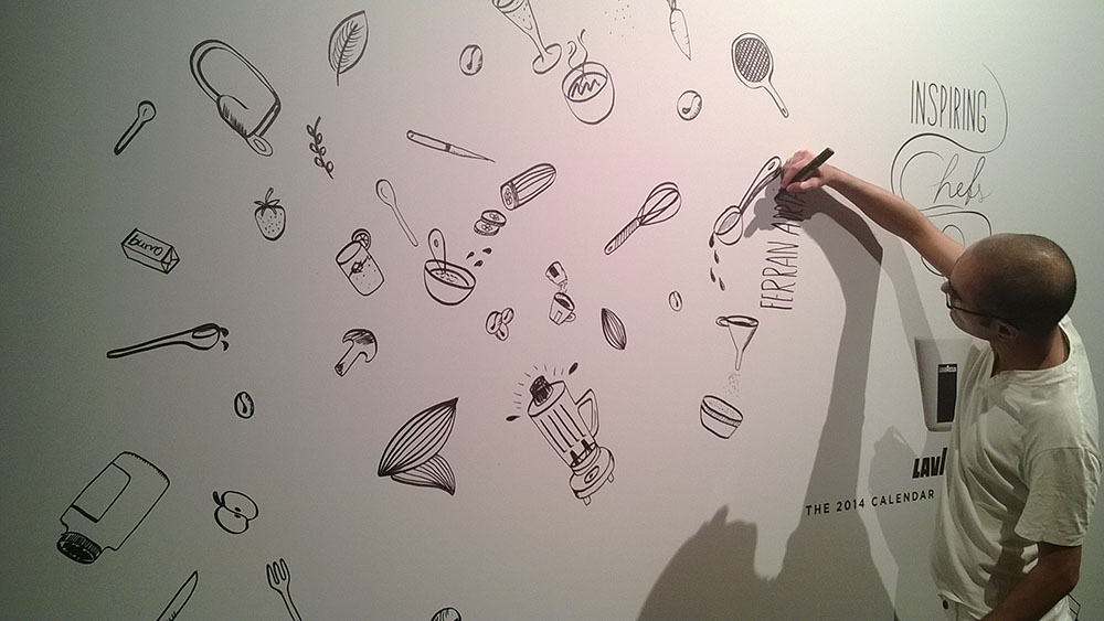
My work was to think and design a identity that reflects the inspiration process, the creativity process and, in this case, through the cuisine. Finding the key style based on several keywords was easy because what inspires the creative people is sensorial stimulation. For chefs the taste, for graphic designers the visual aesthetics.
One thing that both professional and artistic figures do is doodling. Doodling stimulates ideas and helps us focus on a creative invention. So my part in the project as to draw all those little illustrations that became the identity of the 2014 Calendar.
Viene richiesto di ridisegnare l’identità della scuola, tenendo in considerazione gli elementi e il messaggio che una scuola di design deve passare agli utenti, siano questi gli studenti, impiegati, professionisti del settore e direttori aziendali.
*educational projectThe brief was to design a video / commercial that functioned as a "appetizer" of the Institute , so that companies could institute an interest in a partnership and open. In this context, companies are looking primarily one thing: ideas and innovations.
Students IAAD, whose creativity leads them to see things in a different way, composing and decomposing elements, recombining them to create something new and innovative.
This is the promise that we want to move into our spot, we want to show to current and future partners that their product, their company and their image, that throughout IAAD it will take a leap in quality thanks to the different approaches that students have in dealing with a project. The result will be not only something new and of a high aesthetic sense, but also functional and meets not only the customer but the needs of the market.
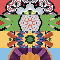
In the video appear four products that represent each department of the institute: Transportation, Communication and Graphic Design, Interior and Industrial Design.
Each item has been assigned a color and characterizing the optical effect of the kaleidoscope, to show the different ways in which students IAAD can see the same product.
The video closes with the arrival of the black square, heart of the identity of the Istitute.
*educational project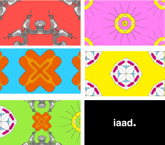
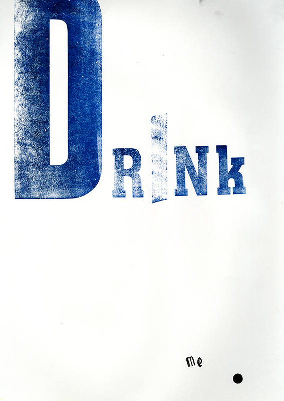
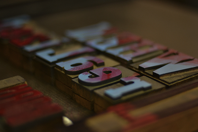
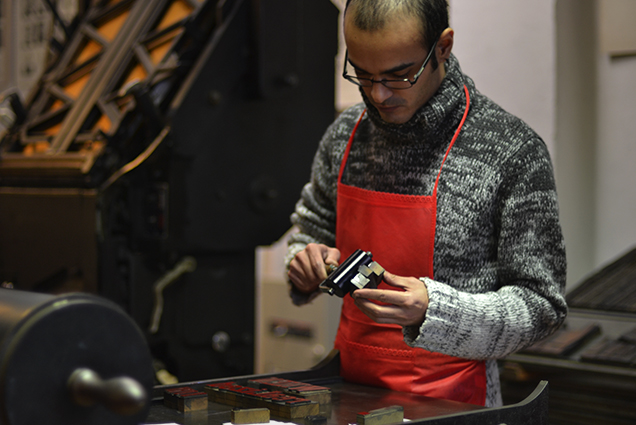
Workshop participation at Archivio Tipogragico in Turin, where we experiment for the first the typography and letterpress technique of printing.
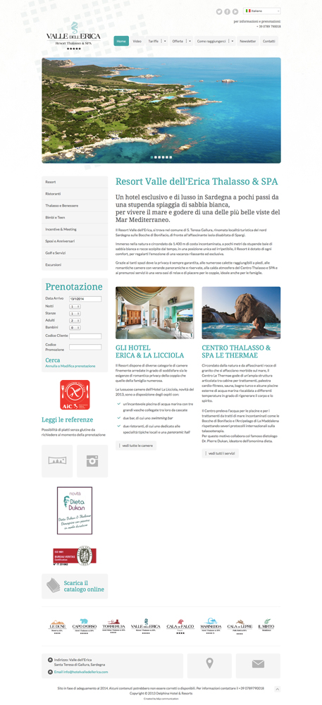
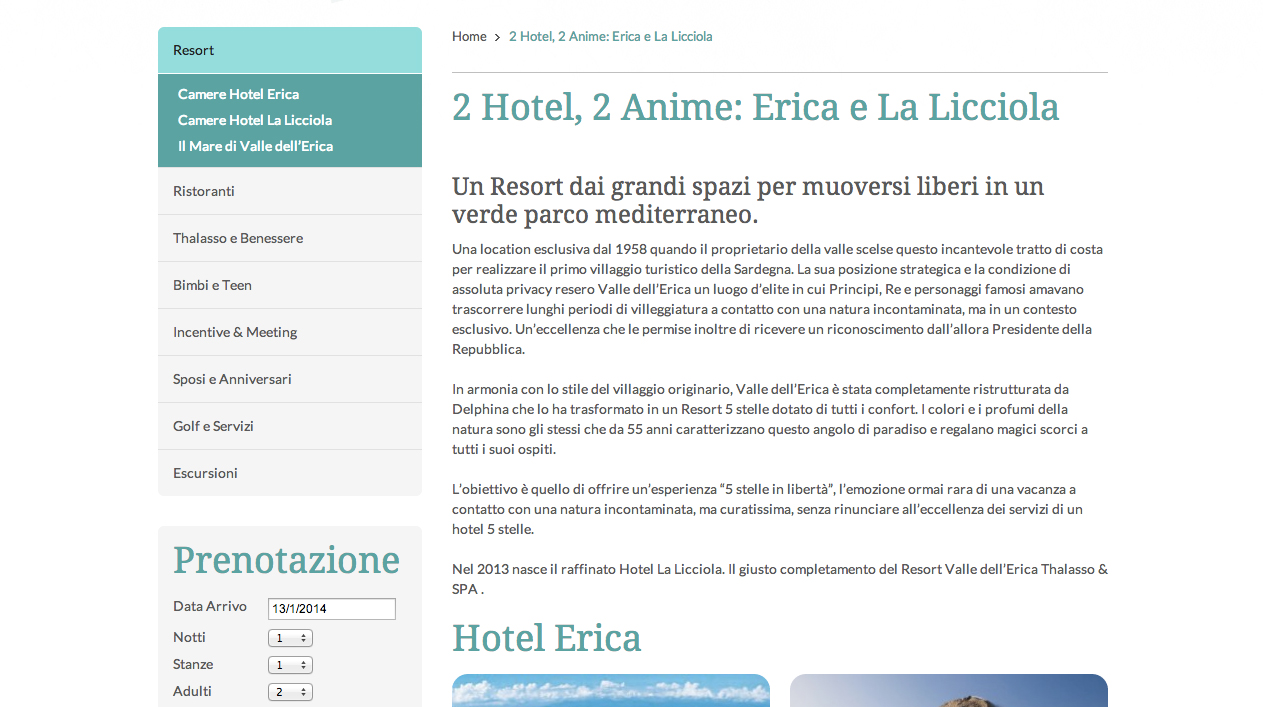
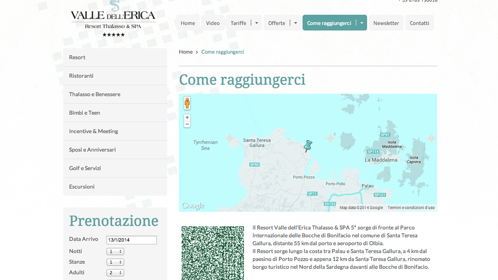
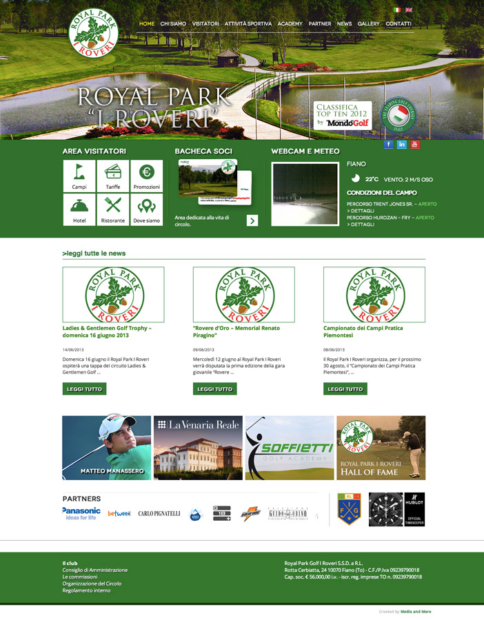
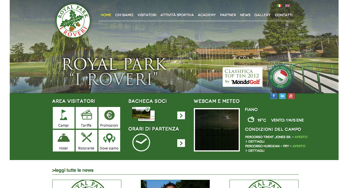
*educational projectGraphic Restyling and developing of Valle dell'Erica Resort in Wordpress. Features: responsive design, CMS, SEO optimization, usability etc.
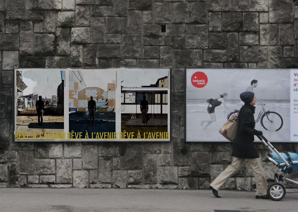
Attesa
Apertura
Possibilità
Sogni
Futuro
Internazionalità
Rêve à l'avvenir. Sognare il futuro, aspettare la realizzazione del sogno.


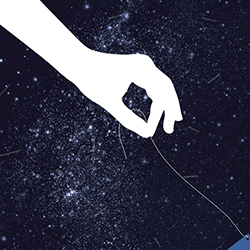
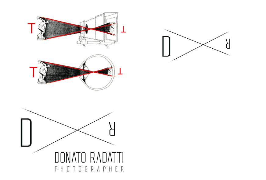
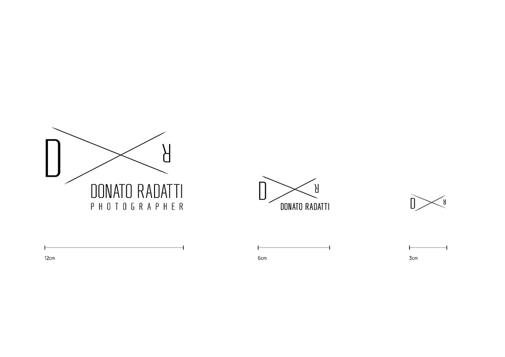
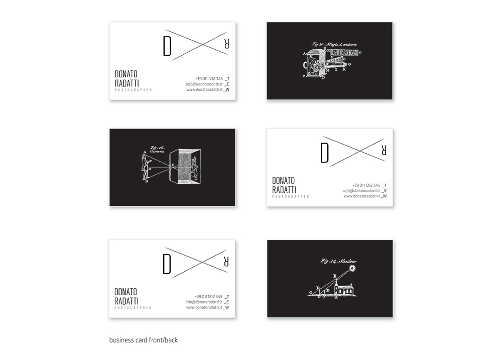
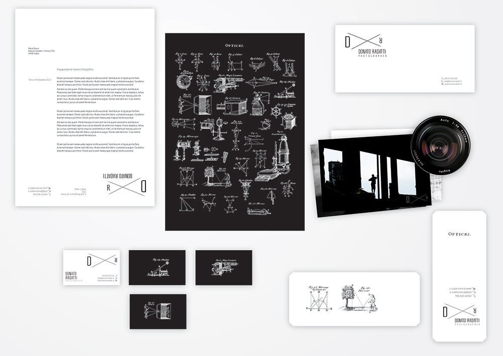
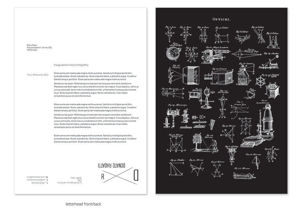
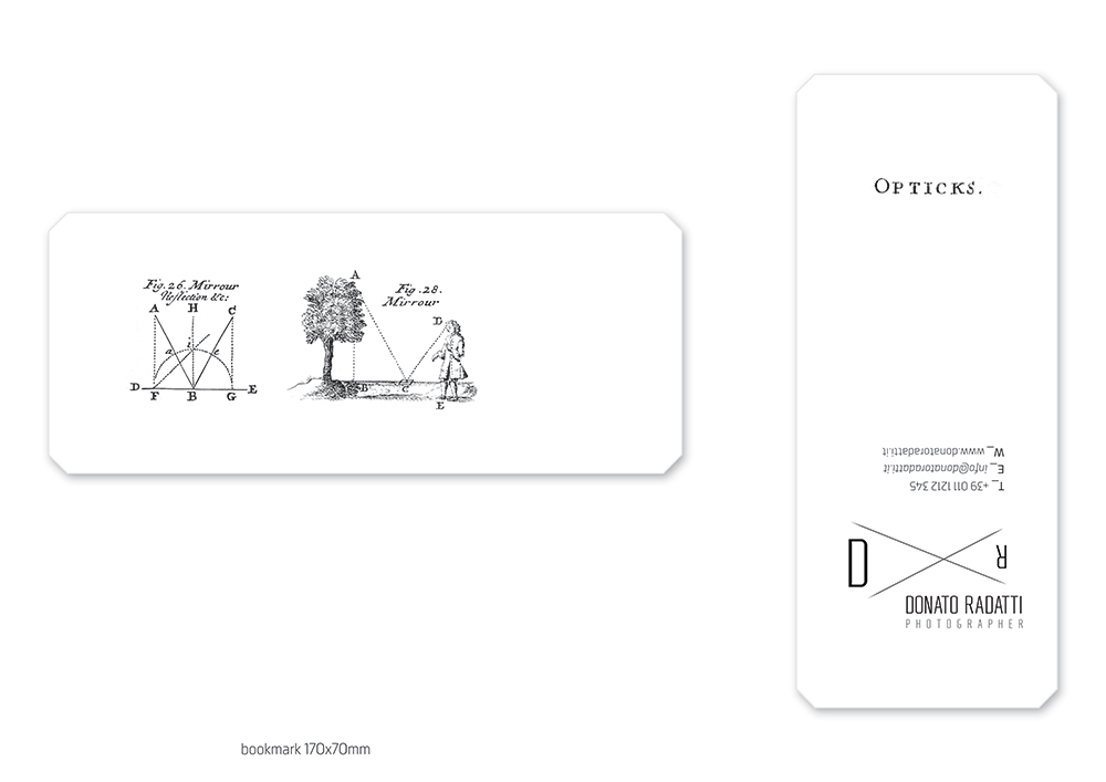
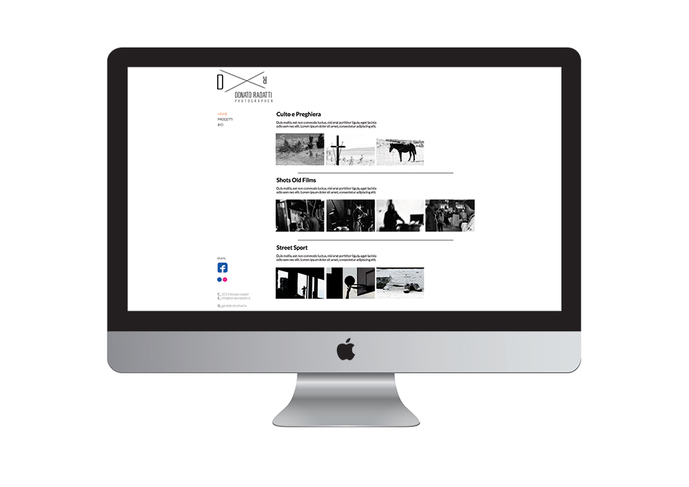
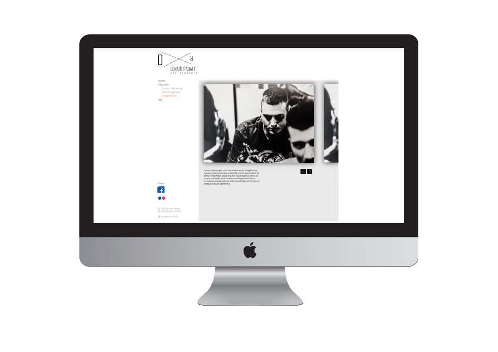
Creating a logo for a photographer that talks about this profession without cliches is a challenge. So, for this logo I've tried to go beyond the surface and enter on the techniques, story, physics and evolution of photography.
I learned that the human eye is comparable to the photo camera because the image that the human eye (or the camera lens) see get upside-down once the image is on the retina (or film) to be later rotated again to its natural direction. So the logo express this schema and communicates that the photographer not only take pictures with his professional tool but uses first the human eye, the intellect to choose when to take a photo.
A nice photo camera can take nice photos but a great photo can only come from a great thought.
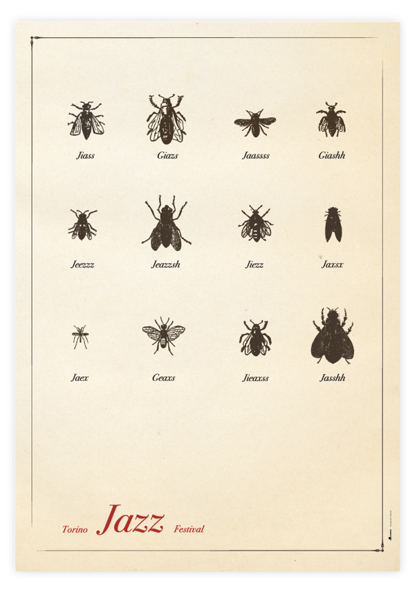
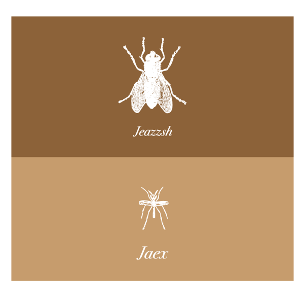
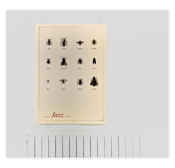
Poster for the initiative Divieto d'Affissione for the Torino Jazz Festival in 2012 with the participation of Isidro Ferrer.
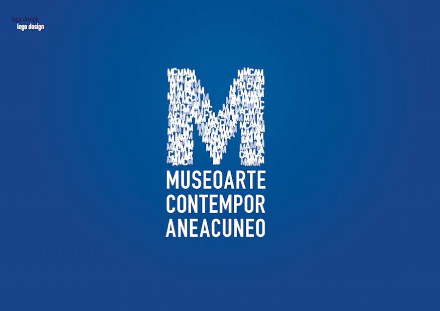
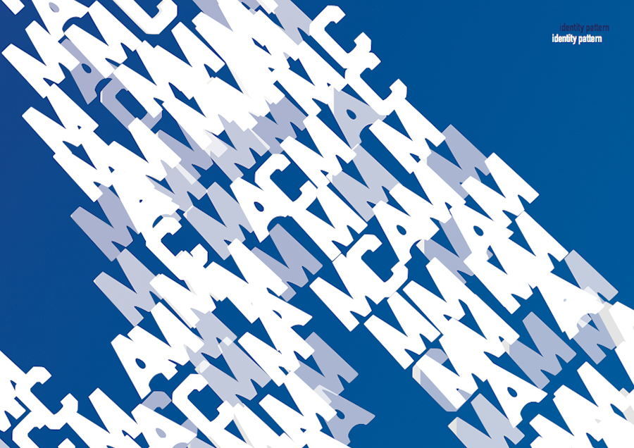
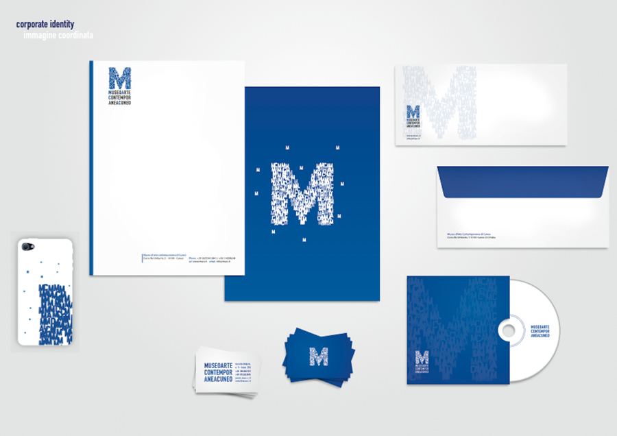
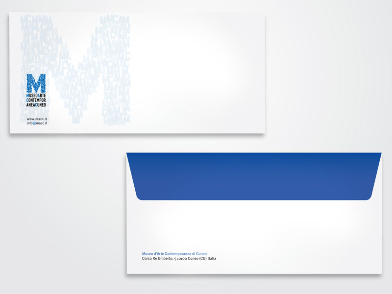
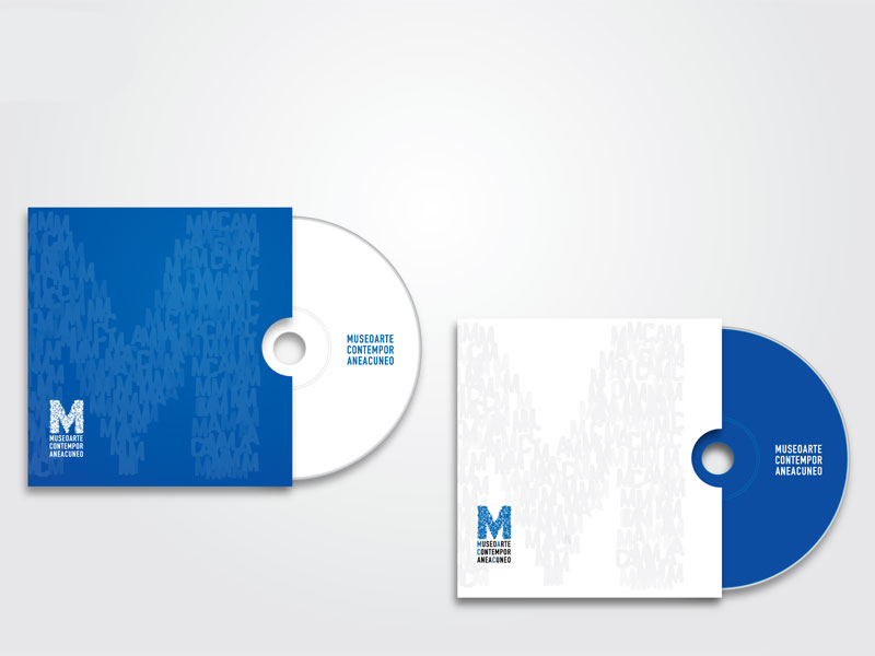
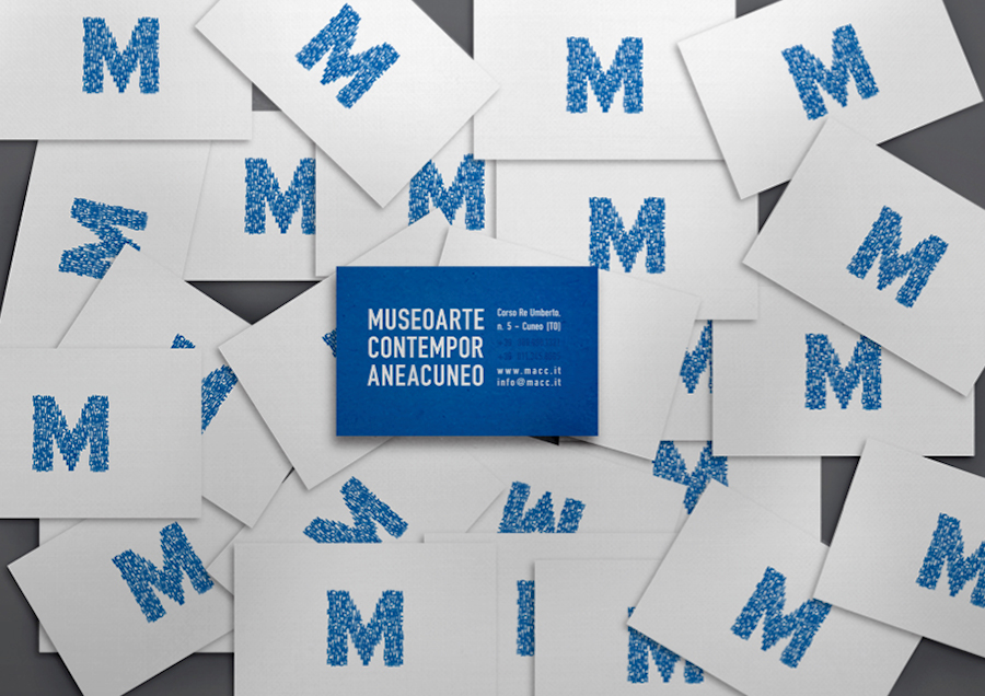
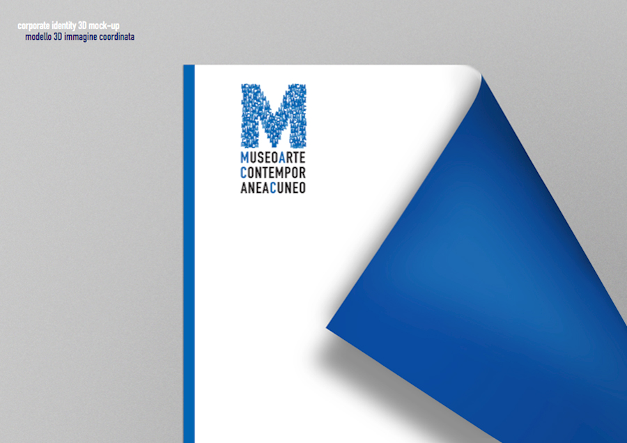
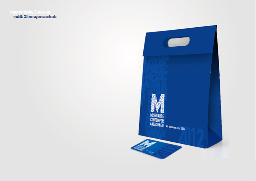
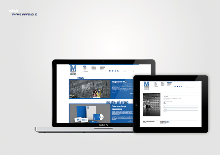
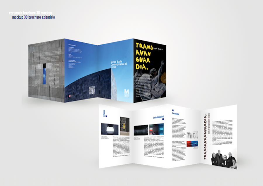
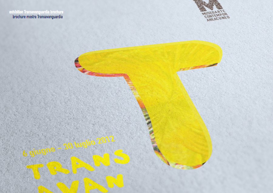
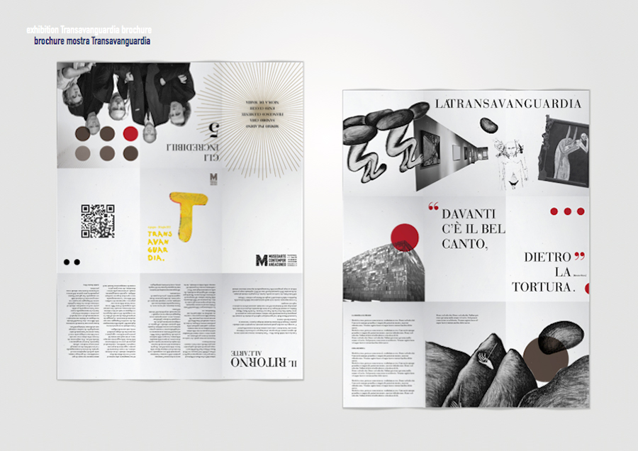
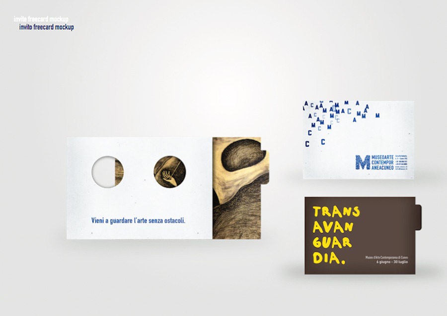
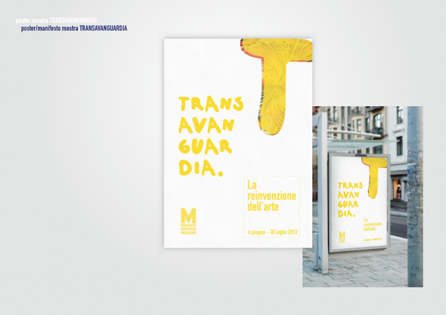
*educational projectMACC (Museo d'arte contemporanea di Cuneo) is born, a contemporary art museum that already has a permanent collection and, especially, aims to make exhibitions that tell the international scene (since 1960) target.
Visibility of events (exhibitions) and promotion of the permanent collection.
Target:
Age: from 30 years onwards
General economic availability
Medium-high cultural level
Participate regularly in cultural events (exhibitions, concerts, conferences, etc.).
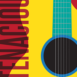
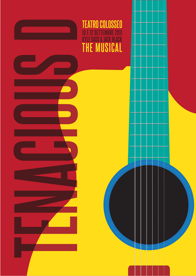
Poster concept of the Tenacious D Musical
TEAM:
Cristina Agù
Alessandro Promio
Geraldo de Oliveira
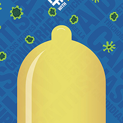
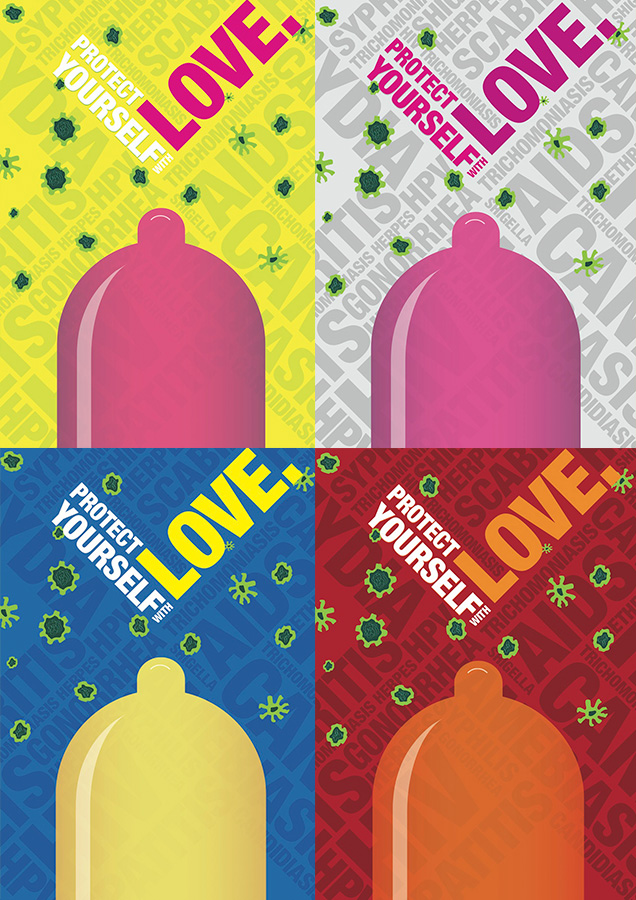
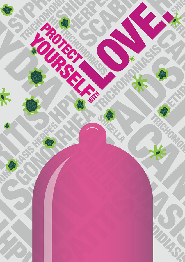
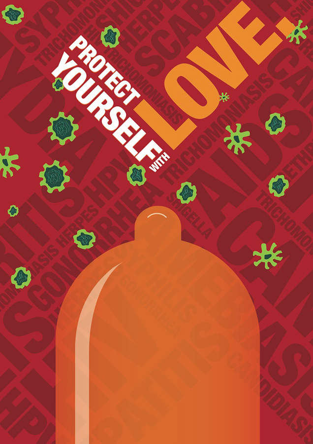
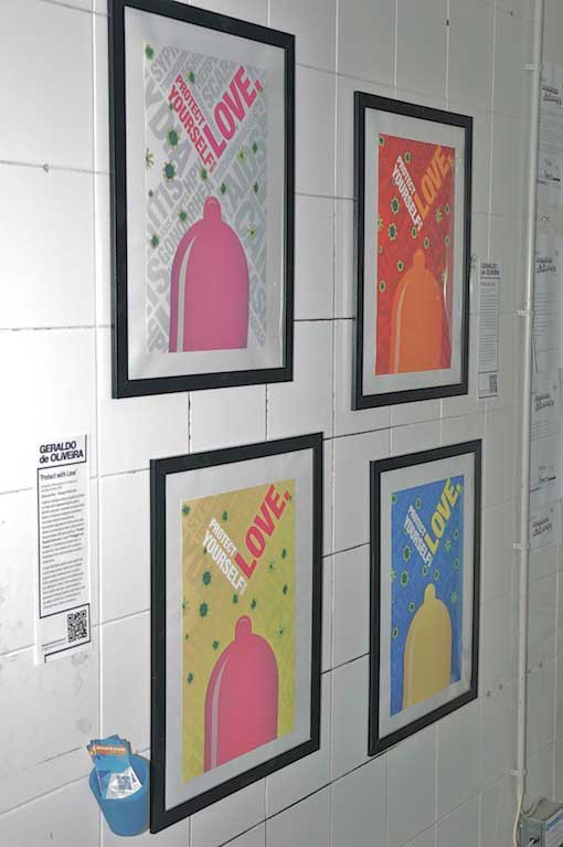
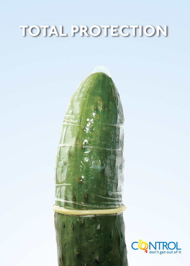
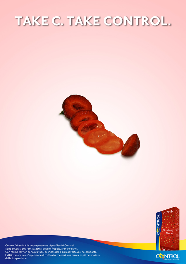
The work appears as a poster and is based on the graphical representation of the sexual act, showing a condom inside homogeneous atmosphere containing viruses of sexually transmitted diseases.
The target of the graphic are set by the color of each poster. The one with the gray background has features such as a poster neutral, generally; the one with the yellow background for teenagers, by the huge impact and contrast between the colors; the red one for young adults, passion and energy expressed by the colors, and for adults the poster with blue background, a color more serious, sober and protective.
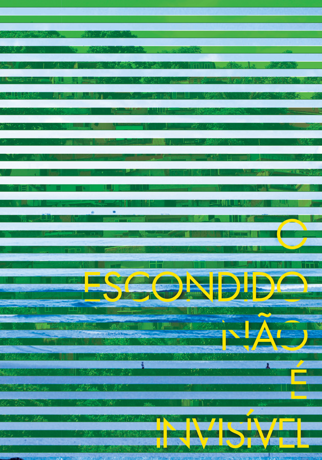
Brazil is a very rich country in terms of culture and nature and is outstanding by its beauty both geological and ethnical but often the inner true is hidden and undiscussed, the reality of the favelas, poverty and delinquency that sooner of later emerge among the nation qualities. Now that Brazil's is growing very fast economically the social problems should be taken more care.
The idea is to interlace those both scenarios giving the opportunity for them to be seen at the same time.
That's the idea behind the headline "O escondido não é invisível" (What's hidden isn't invisible). What's isn't on the surface, what you can't see clearly doesn't mean it's invisible. If you look carefully I'll be able to see what as well.
The colors are helpful to explain the nationality of the argument, green, blue and yellow are instantly recognizable like Brazil flag's colors.
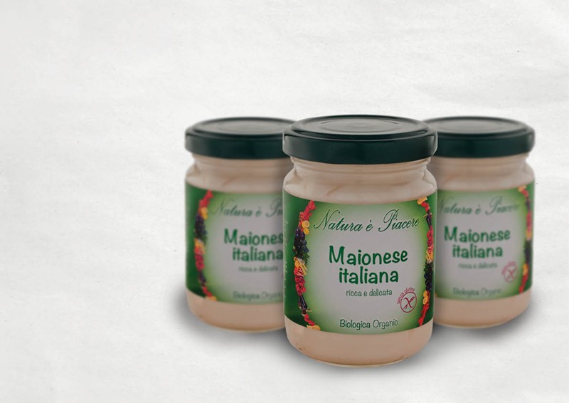
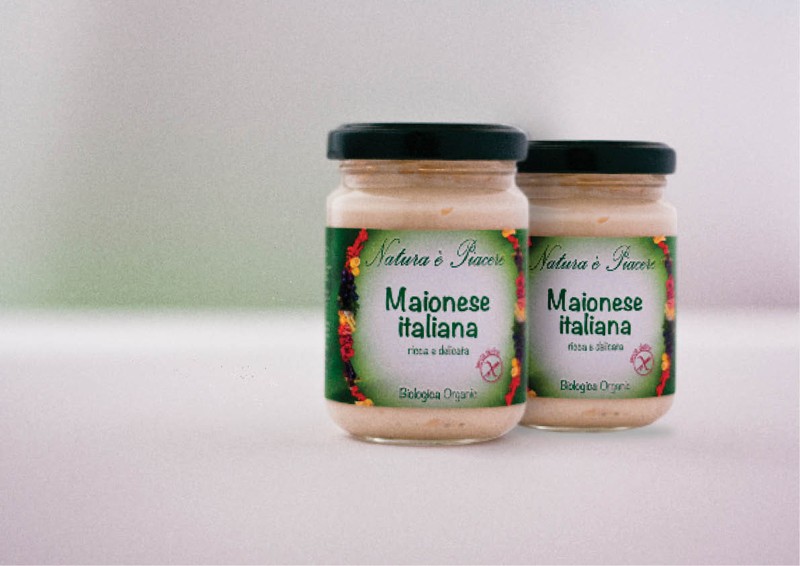
The graphics solution chosen is a redesign of the original label. More modern, and appealing to consumers with a best reading hierarchy. The graphics are coherent with the main features of the products "Natura è Piacere" and the philosophy of this company, ie, the goodness, the search for quality raw materials and organic with a cut more towards the non-industrial 'crafts, but homemade.
The range of products "Natura è Piacere" is dedicated to those seeking a natural well-being and full of flavor, in addition to the class of celiac disease. Through the careful selection of ingredients, the products "Natura è Piacere" are characterized by the taste and flavors are simple but winning, recognizable ingredients, natural look.
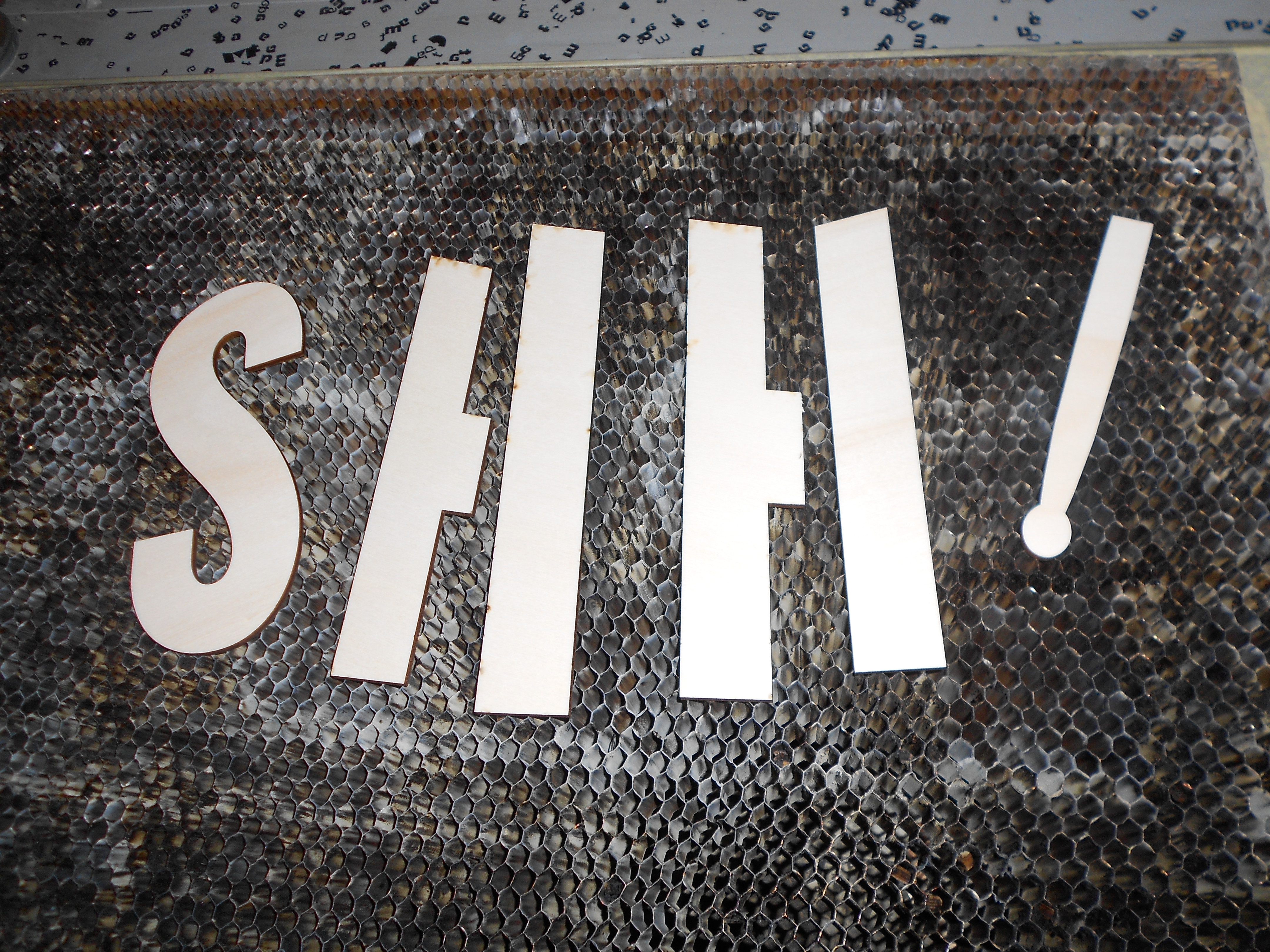
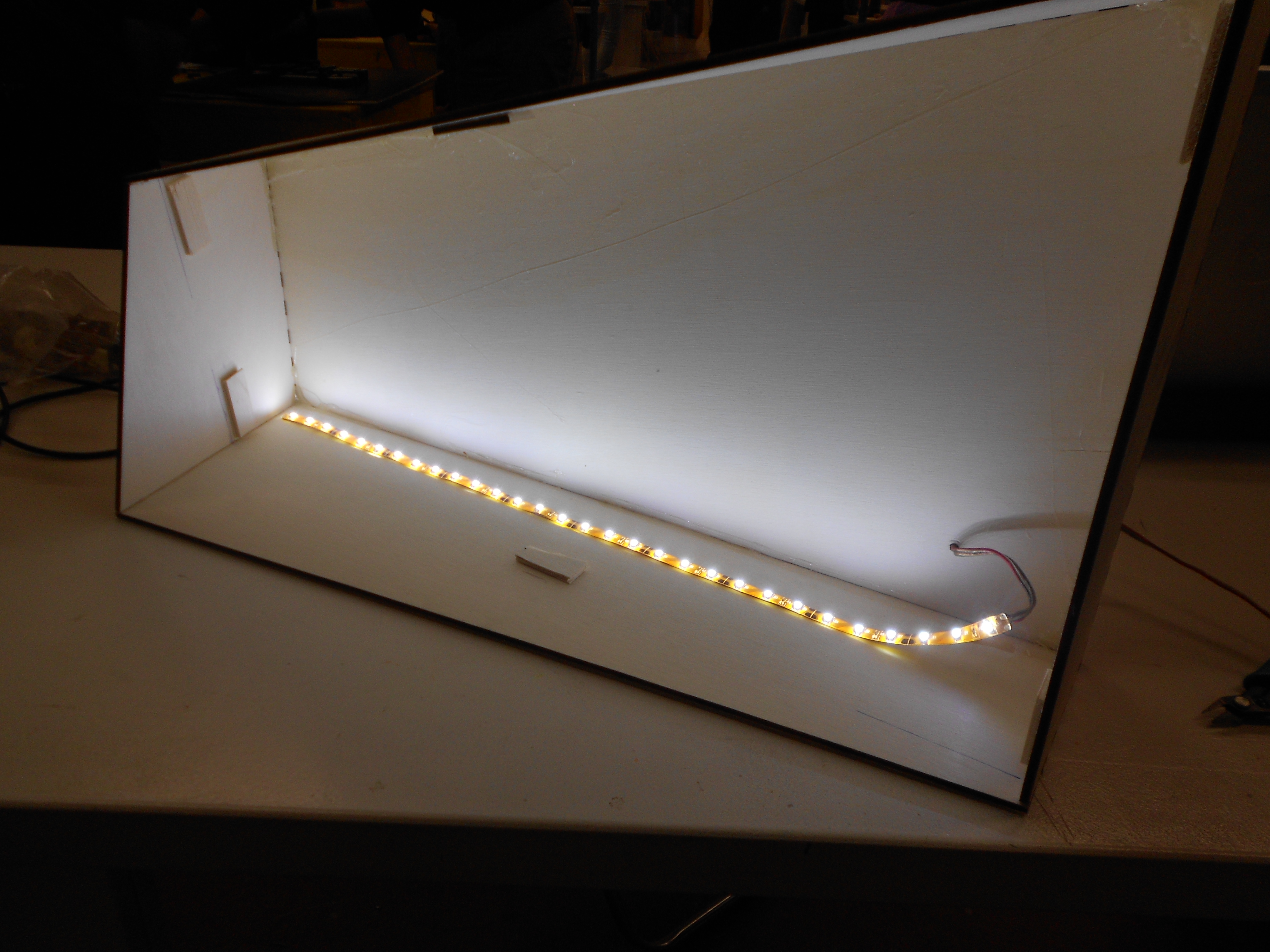
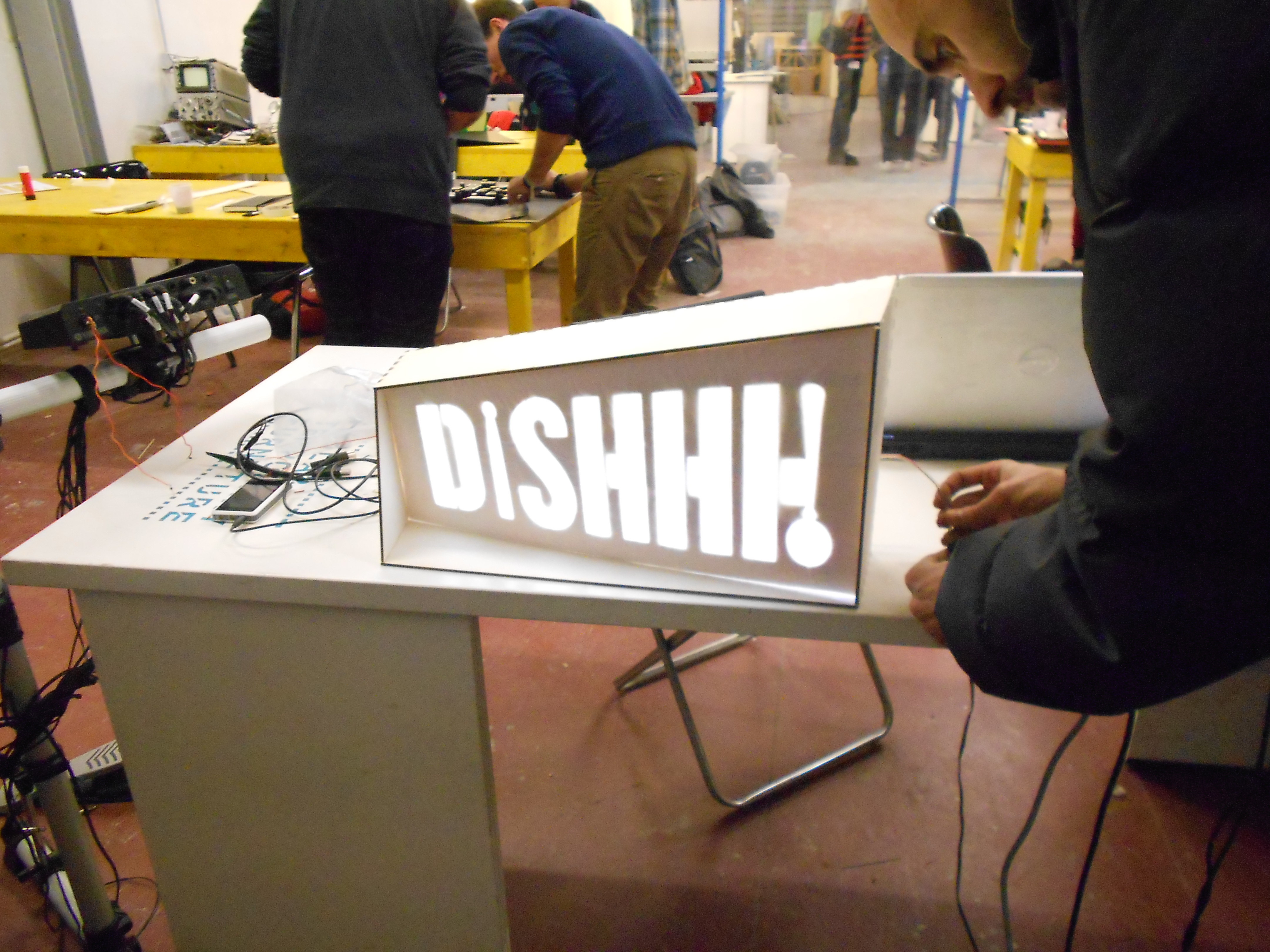
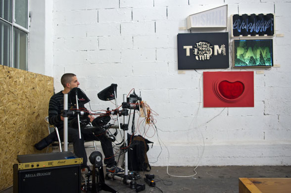
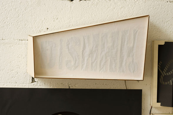
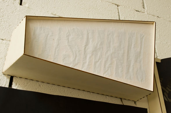
*educational project"Type drum machine" is a combination of type and music through the rhythm of the drum. The idea of the workshop consisted in creating all sounds made by drum's instruments: "Dishhh..", "Chaf..", "Tom", "Dum" and "Pam". In team we made new fonts and logos and we chose a color for our future "typesound". Type drum machine - workshop Innesto by Happycentro + Fablab Period by Thype 6th December 2012 Turin
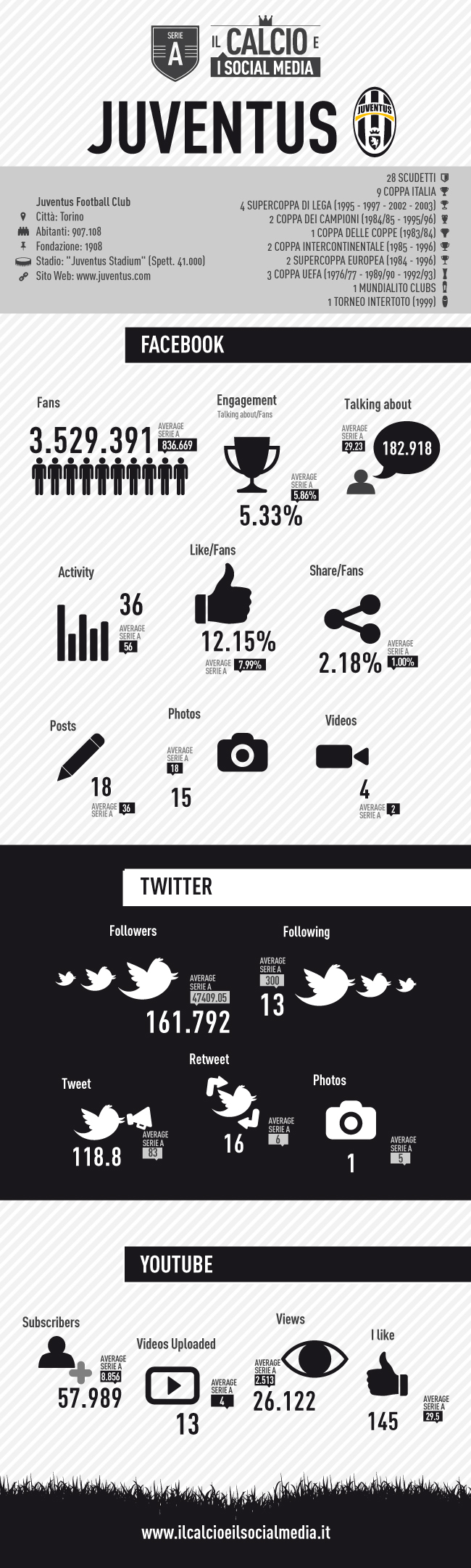
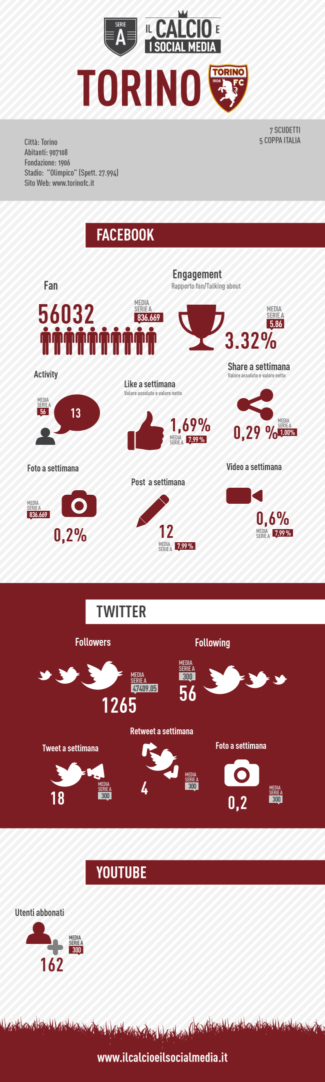
Social media which are under the spotlights of online communication include the dynamic relationships between people. You can therefore talk of ethnography or, more specifically, to analyze how communication evolves in such a dynamic contest.
Trying to understand how these dynamics are translated in the various contexts of people relationship and aggregation is a topic of big interest.
That's how "bar sport" talks become public, in one big place where main actors can have their say, as much as the newcomers.
The way people talk about football changes, but even the way teams and players measure up with their fans. The rumors in the locker room, health status or any other particular can come out at any time with a tweet. Not to mention that being on a social network is not enough to be "social", so even this world has its ranking of people whom are nice to be followed even out of the soccer field and without anyone's mediation.
Team:
Andrea Carpenè
Paolo Data
Alessandro Promio
Andrea del Bene
Dario Catto
Anna La Rosa
Alessia Pascarella
Elia Pittavino
Audric Dandres
Geraldo de Oliveira
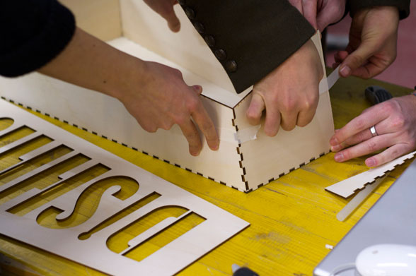
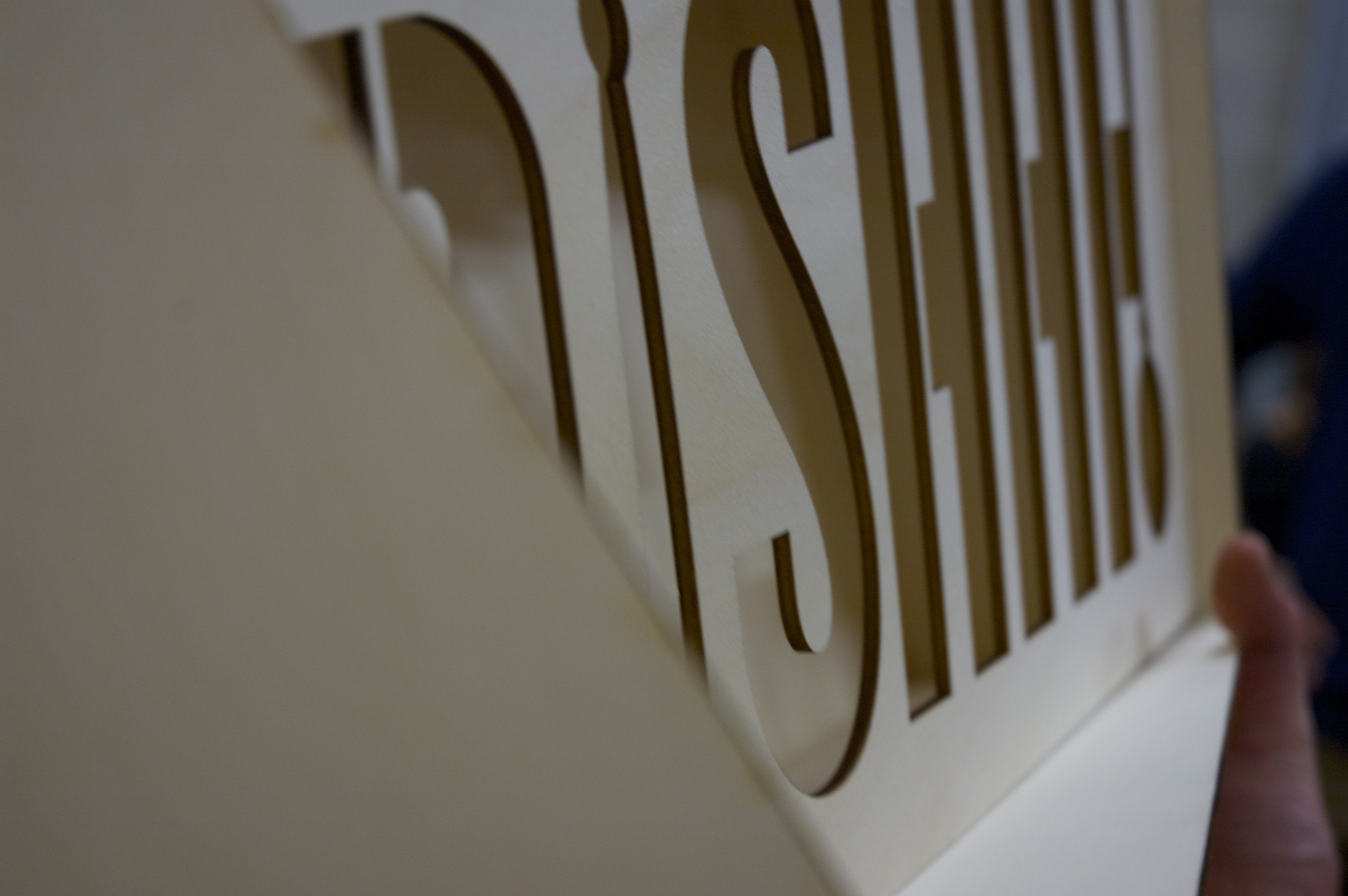
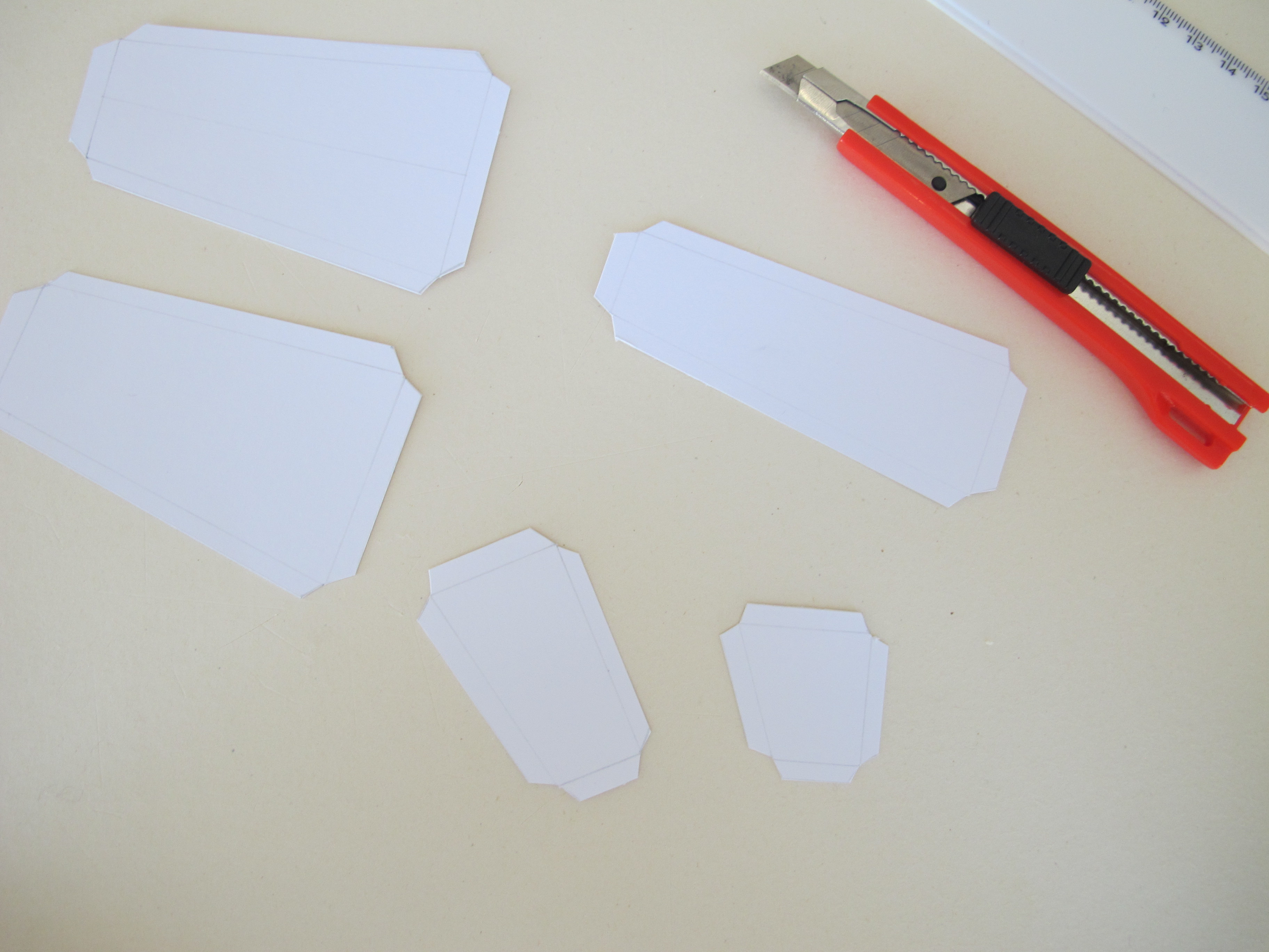
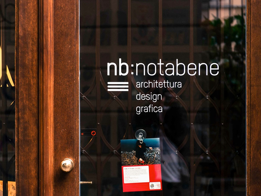
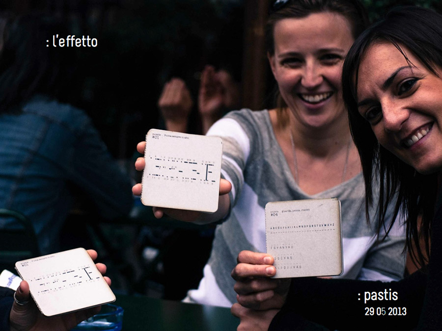
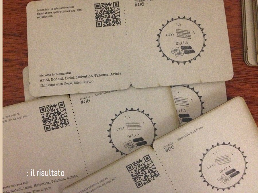
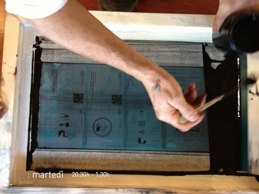
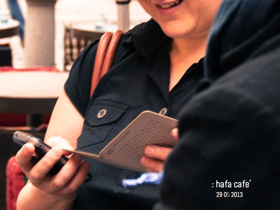
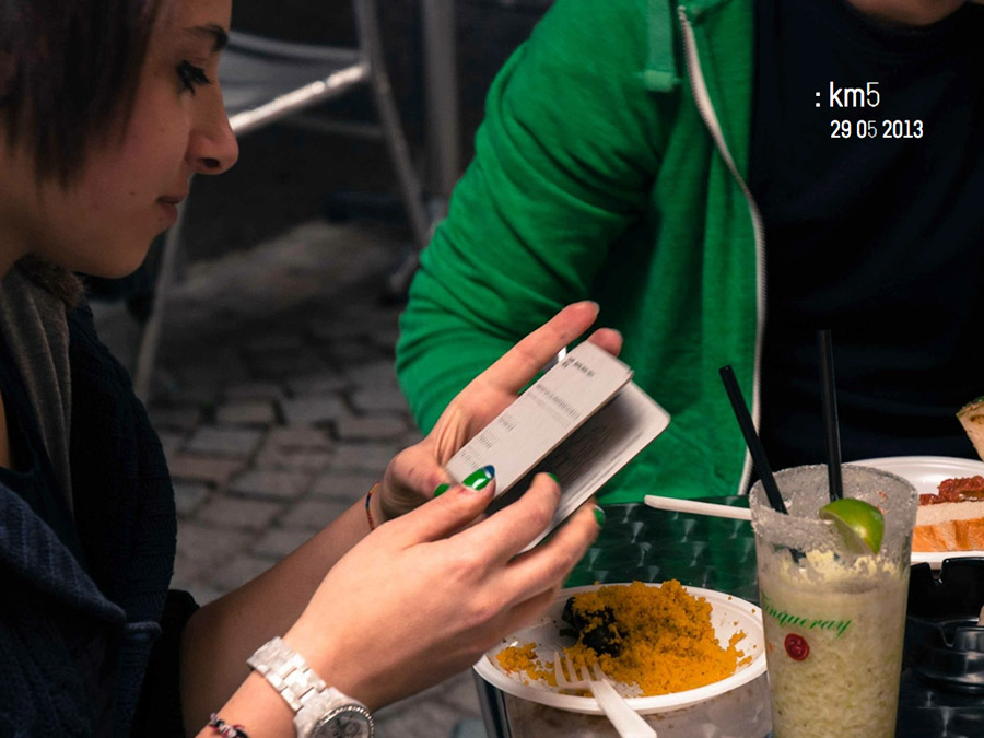
L’obiettivo di questo progetto era di usare la creatività per promuovere la libreria notabene (situata nel Quadrilatero di Torino) con una comunicazione non-convenziale e un budget molto basso.
Materiale/tecniche:
Cartone vegetale da 1,5mm; tagliato a laser; stampato in serigrafia a un colore
TEAM:
Cristina Agù
Andrea Carpenè
Nehal Desai
Geraldo de Oliveira
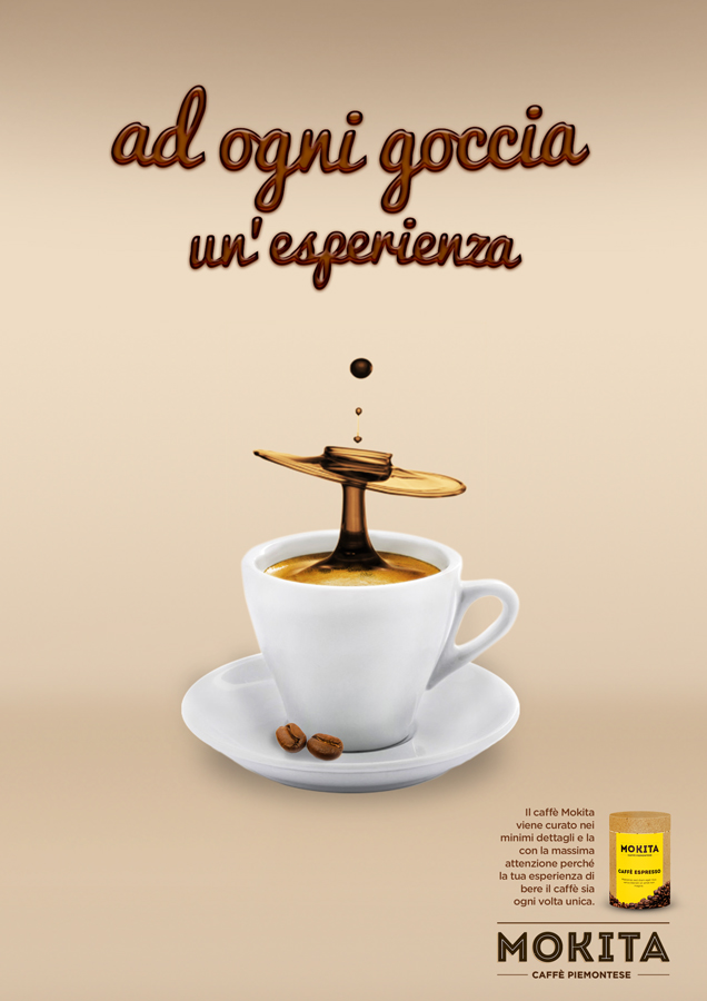
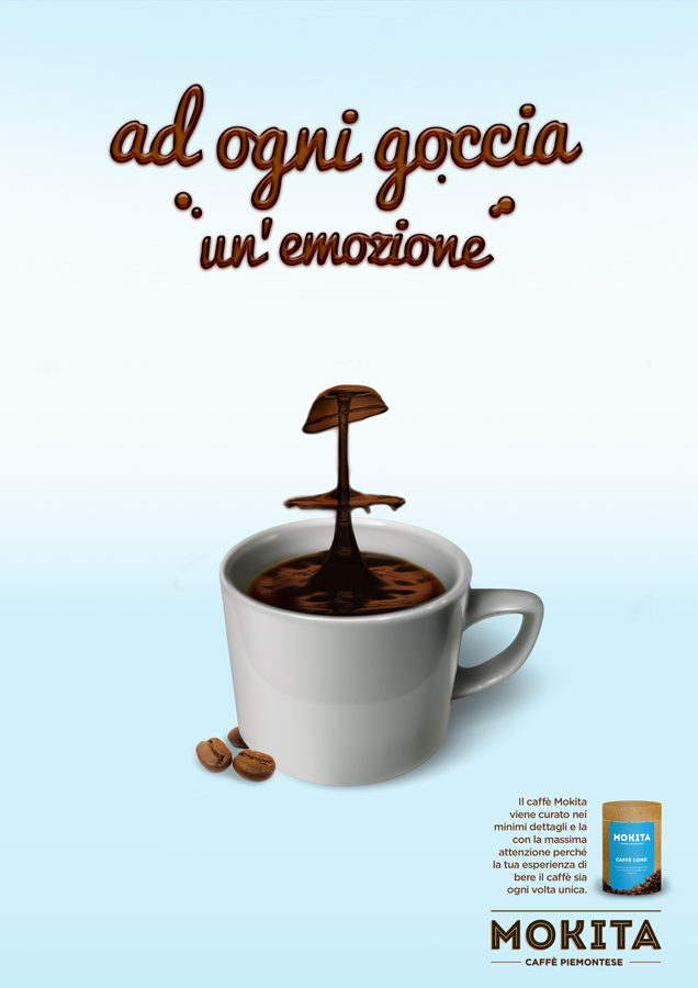
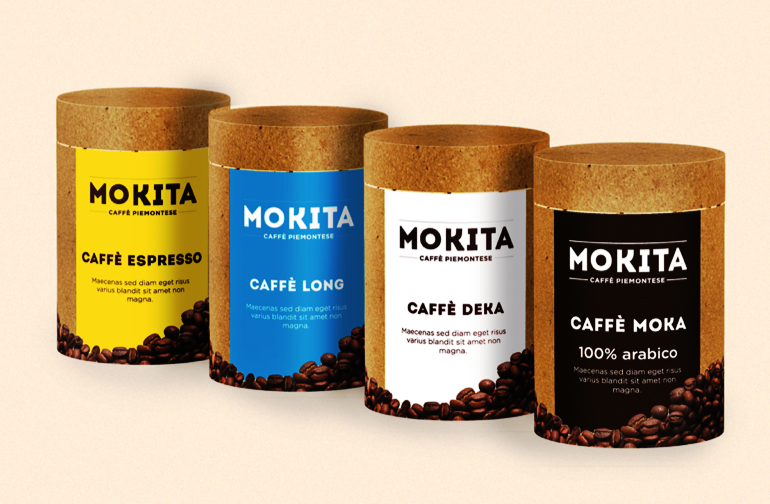
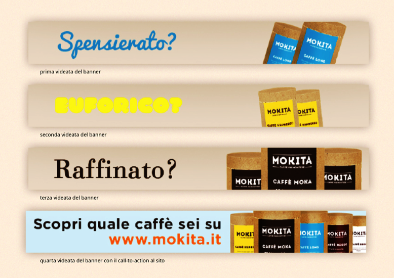
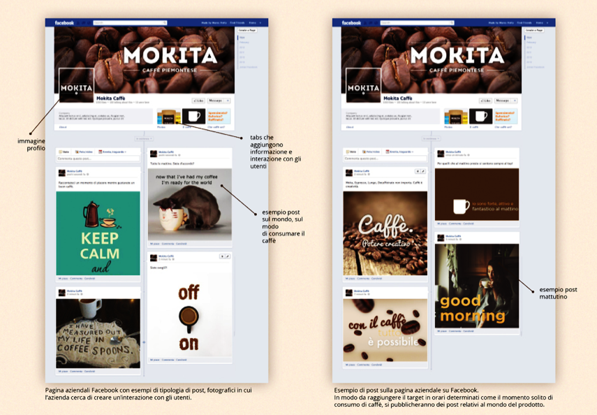
Mokindustry presents itself as a brand in the market Piedmontese little known mainly for missed communication strategies to target. Its brand, Mokyta is thus presented now in problems of notoriety and sales and wants to implement a communication plan that will solve this problem.
*educational project